Hello all!
This is a strange post. Typically, I post artwork that I have done, or post thoughts on art that have been blubbering around my head. Seriously. They blubber sometimes.
Today, it is both.
In the small town where I live, there “has always been” (ie. that I can remember) at a local car dealership, a vintage, 1950/60’s neon sign dedicated to the Oldsmobile Rocket.
Now, for those of you too lazy to take time to Google “Oldsmobile Rocket” before reading the rest of this article, The Oldsmobile Rocket V8 engine was an 8-cylinder motor that had some modifications from the traditionally produced engine design that delivered more power. It really was part of the birth of the “muscle cars” that we think about in the 50’s, and like all things 50’s, had a cool, space-age name “The Rocket V8”!
So, imagine me as a boy, if you will. Other than time spent in a small, elementary school, I spent most of my time in pastoral beauty….green trees, tractors and happy cows.
Then, on a ride into town for come ice cream at the local Dairy Queen, I see something like this:
(only the sign I saw was mounted on a taller pole)
Pretty space-age, right? That thing looks like it was ready to launch at the moon….or the Commies. You know. Now at night, the thing is completely different….lit up in pulsing light, shining like a pink, neon star.
And it’s still there.
So, stupid me, who never learns from other people’s mistakes thought “Hey, I’ll bet getting a photo of that rocket sign at night would make a really cool watercolor!” Idiot. But what the heck, right?
So, I go down with my camera and tripod and snap a few shots of that neon beauty. I work it up in watercolor, and after a few days of work, come up with this:
(Click to view it large)
So…it’s ok. I actually thought I was done at this point. I knew the background wasn’t dark enough to really pop the neon light like it should, but I enjoyed the blue color and the texture of the otherwise blank, night sky. I was just going to leave it alone and move on.
And I would have Failed Accidentally.
What I mean, is that there comes a time when an artist needs to know when to leave a piece alone to keep from ruining it….before he pushes the thing beyond the hope of salvation…..but there’s also the danger of stopping BEFORE going far enough.
Tricky, isn’t it? I mean, how far is far enough?
Well, this piece nagged me. I wasn’t happy with the outcome. Sure, I liked PARTS of it, but on the whole it wasn’t doing much. In short, it was failing.
So, what to do when a piece is failing? Well, the great thing is, since it is ALREADY failing…what’s the harm in pushing it?
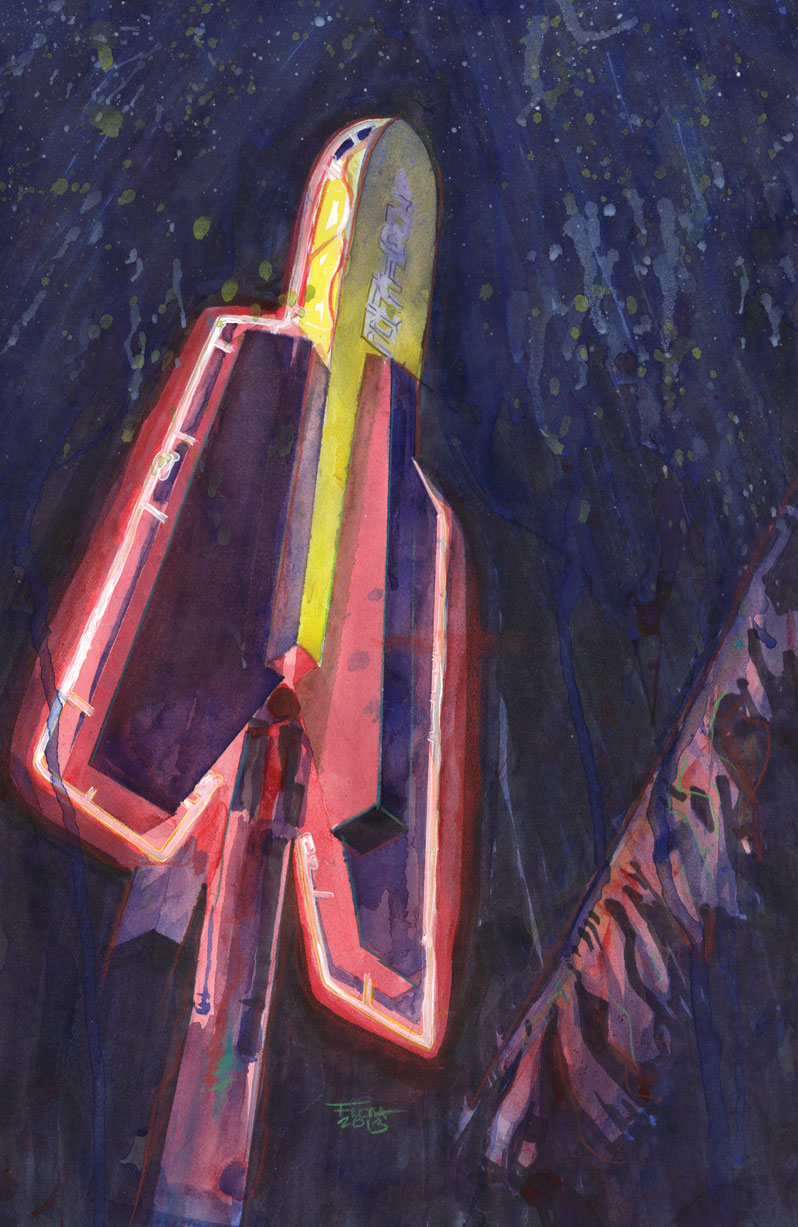
So, that’s what I did.
(Again, bigger is better, so click!)
I slammed the background into black. Well, it’s not ENTIRELY black…there’s plenty of subtle colors and textures back there…but it’s definitely dark. I also pushed some of the darks in the sign itself to bring out the angles and to fade the top into the sky.
Maybe I destroyed the thing, but I think it focuses the eye on the bright, electric lights of the piece instead of bouncing around the background. There is less motion, perhaps, but it has that icy stillness like that frozen moment before a rocket makes its jump for the stars.
So, it may still be a fail, but at least it is a fail because I did TOO MUCH and not because I lacked the guts to DO ENOUGH.
My advice to you is to be gutsy. If you screw it up, you can always do more art.
More later,
-Dave


Very cool. Thanks for plopping your thoughts down alongside the paint. I've been following your blog for a while now (although I've switched personas at least once.. schizowebia?) Anyway, keep giving us more awesome! 🙂
Thanks, Nether! I'm glad that (in whatever persona you have currently) that you're enjoying my blog. I'll try not to disappoint in the awesome department! 🙂